Design Thinking Module for non-design students at the National University of Singapore (NUS)

Year: 2021
Tools: Adobe Illustrator, Adobe After Effects
Project Overview
NUS launched a new design thinking module for non-design students. I was responsible for the development of the brand identity and brand guide for the professors and teaching assistants to assist them in developing teaching material for the classes.
Goals
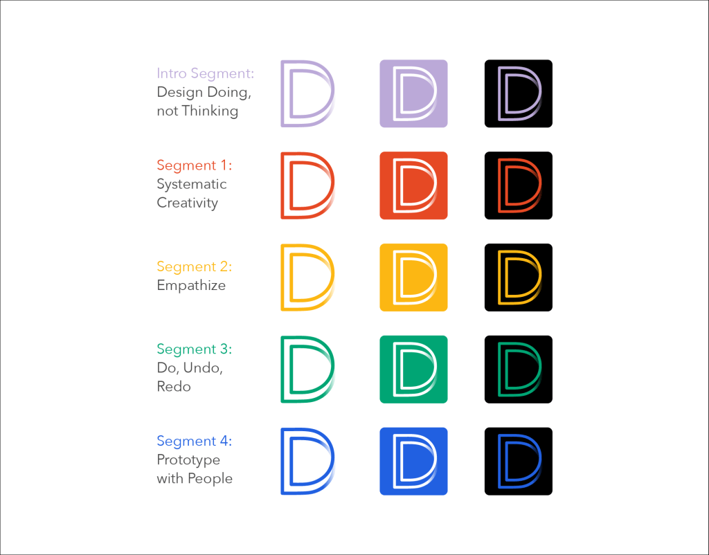
The aim of the brand identity and its logomark was to convey the spirit of design thinking to students who are new to the process. It was important to create a cohesive language throughout the five segments of the module to enhance the students’ experiences as they journey through the seemingly different, yet closely linked, segments of the design thinking process.
The Design
A letter D formed by synthesizing two letter ‘D’s to form a continuous loop, it represents the iterative and non-linear process of design thinking. The overlap provides a sense of depth, signifying the different level of understanding of the problem every time we research, ideate, iterate, prototype and test during the process.

The colors have high saturation, working well with both light and dark mode. As students often print out the content of the class, the contrast enables worksheets and slide decks to be printed in monochrome.
Following the visual language of the logo, elements developed for the course materials are mainly outline icons.

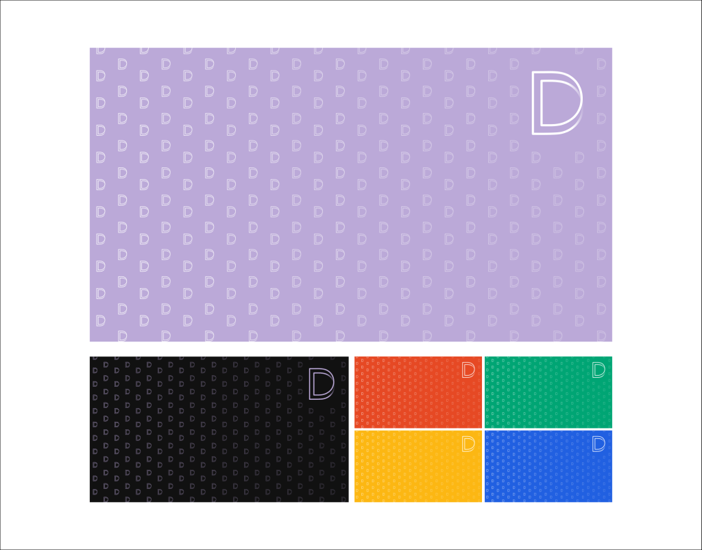
Due to the pandemic that led to many classes going online, backgrounds for Zoom are developed using repetition of the logomark and its respective color.
A brand guide was developed to assist future designers and teaching assistants to further develop the brand identity of the design thinking module.
